
We design for a better life.
At TEAMS, our foundation remains unchanged — our business model, purpose, culture, and heritage continue to guide us every day.
What has evolved is our visual identity. In line with our ongoing journey as part of Kearney, our brand has been refreshed to better reflect who we are today and where we are headed.
This page is more than just a set of guidelines. It is the single source of truth for TEAMS brand assets — from templates to design resources — giving every studio access to the same tools and information. By working from one unified hub, we ensure that our communications remain consistent, aligned, and true to our brand across all channels.
Quick Downloads


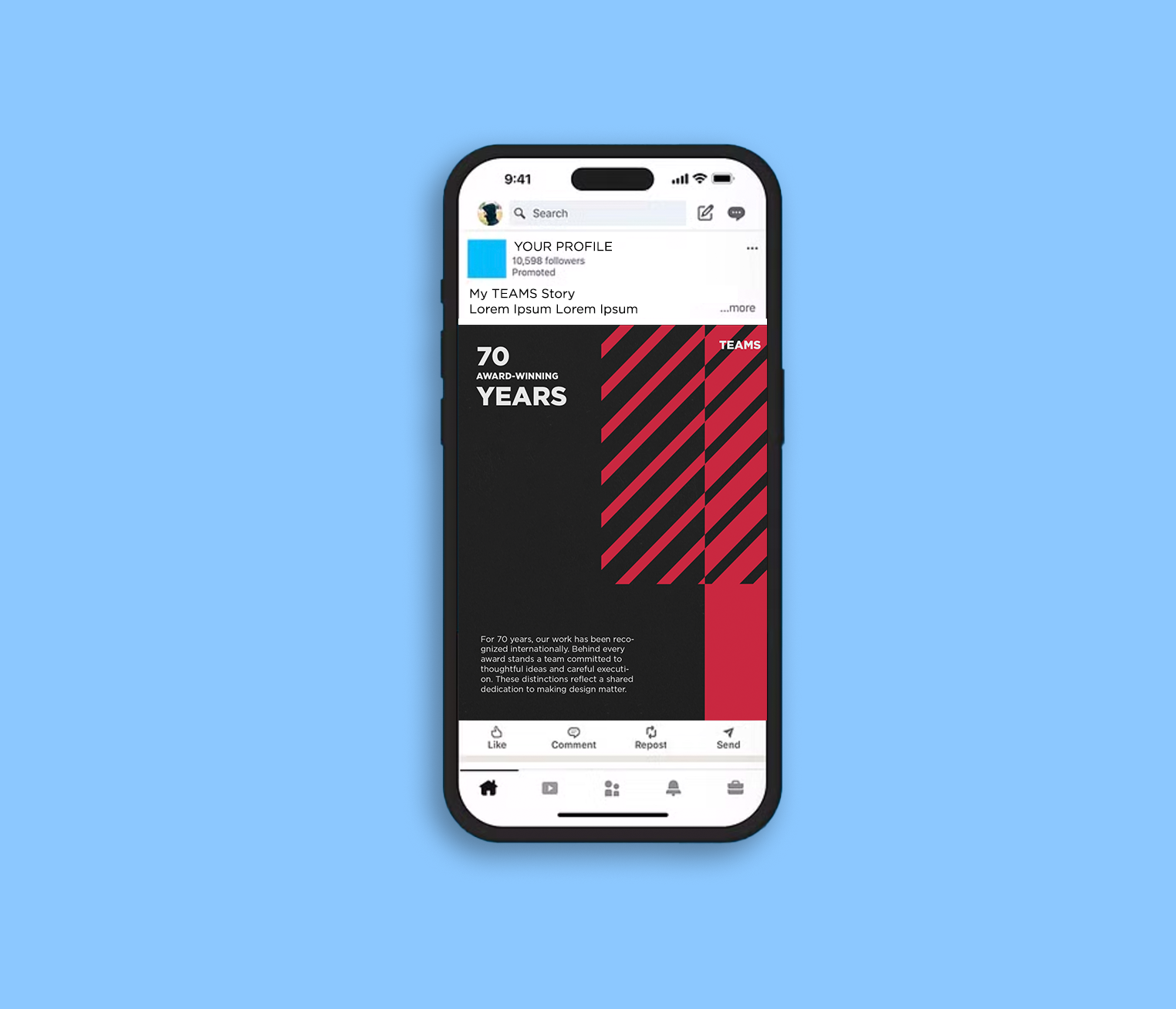
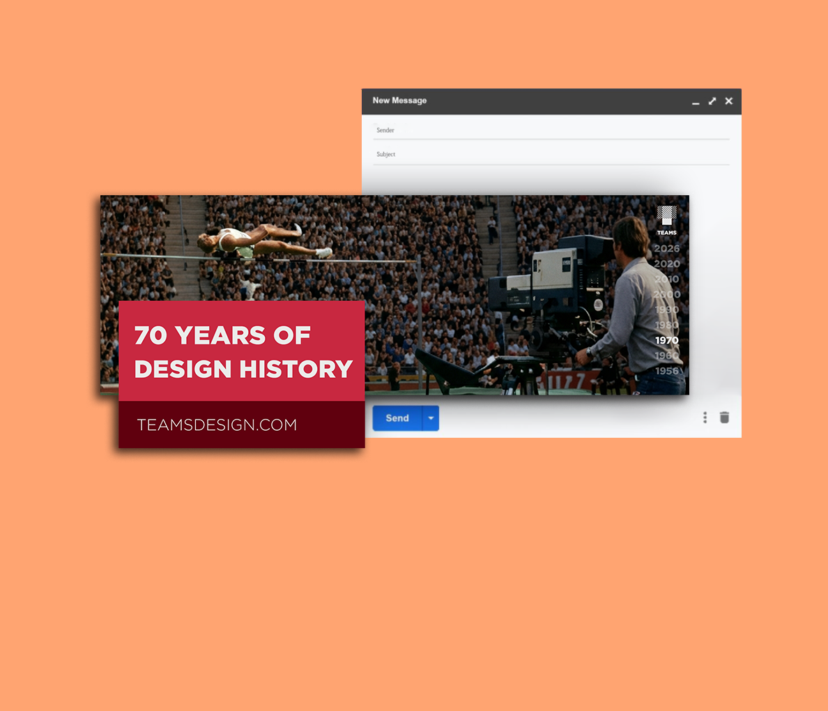
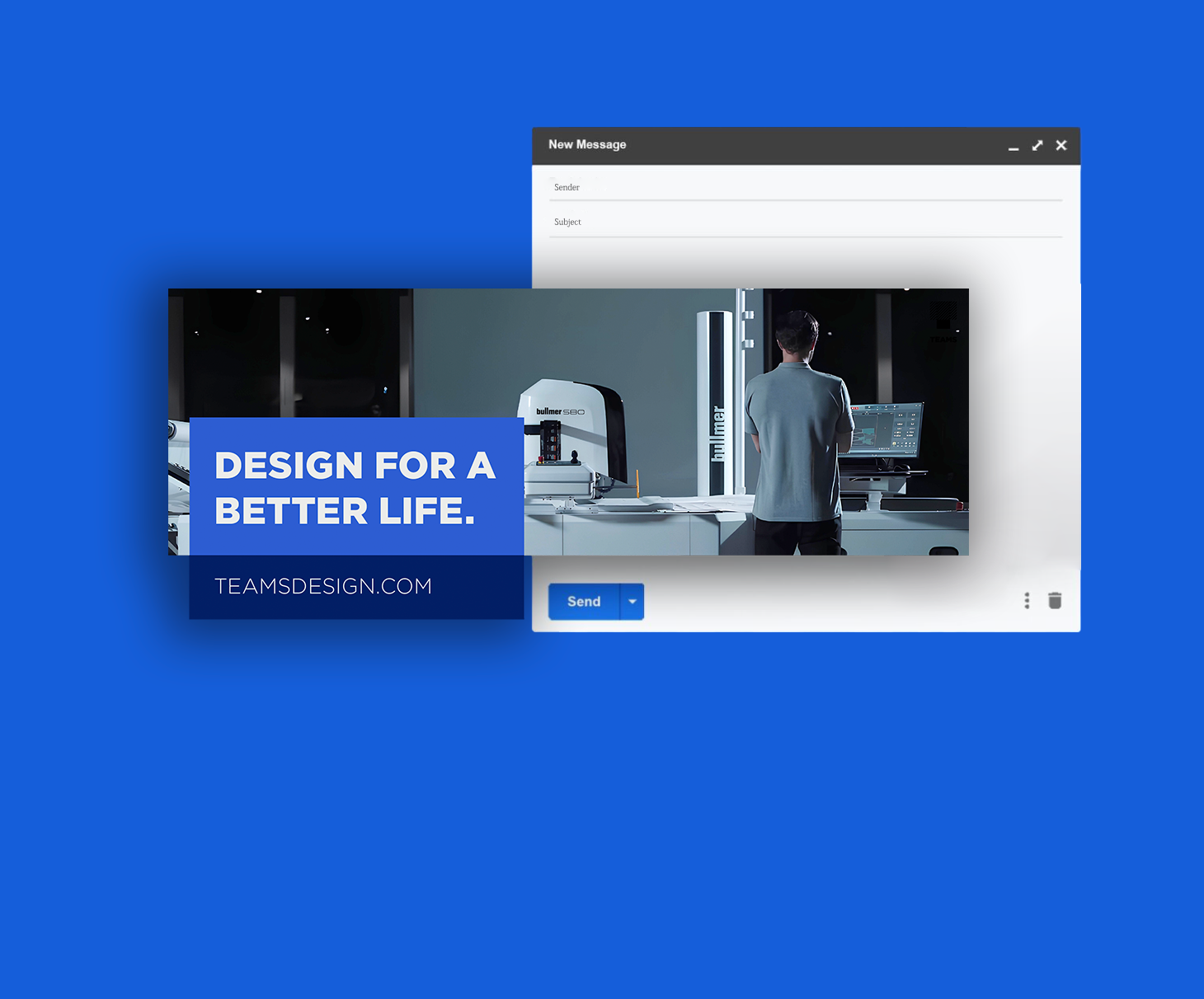
Brand Basics
Brand idea
We believe successful solutions come from mutual understanding
Logo Guide

Misuse
TEAMS colors should always appear consistent throughout all formats. The colors should never be reimagined, tampered with, or modified in any way. Below are some absolute DON'TS.
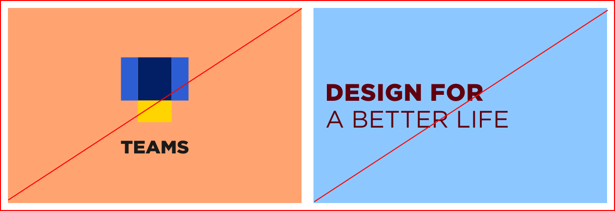
Do not try different combinations as the ones indicated in this guideline. The Brand colors where conceived to be combined in a specific way. Any misuse of the colors and color combination, will lead to inconsistencies in the brand communication.
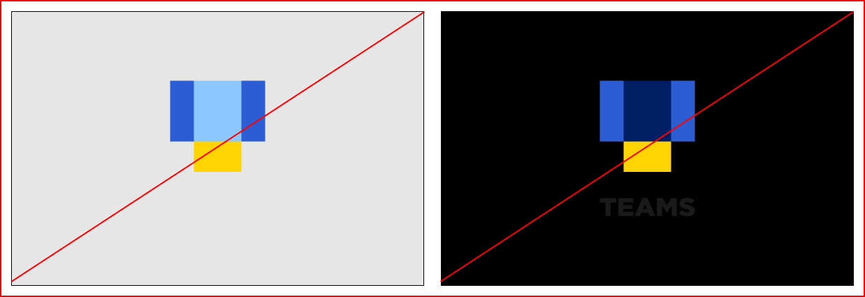
Do not use the light logo variation on light background and the dark logo variation on dark background as this will affect the visualization of the logo in its totality.
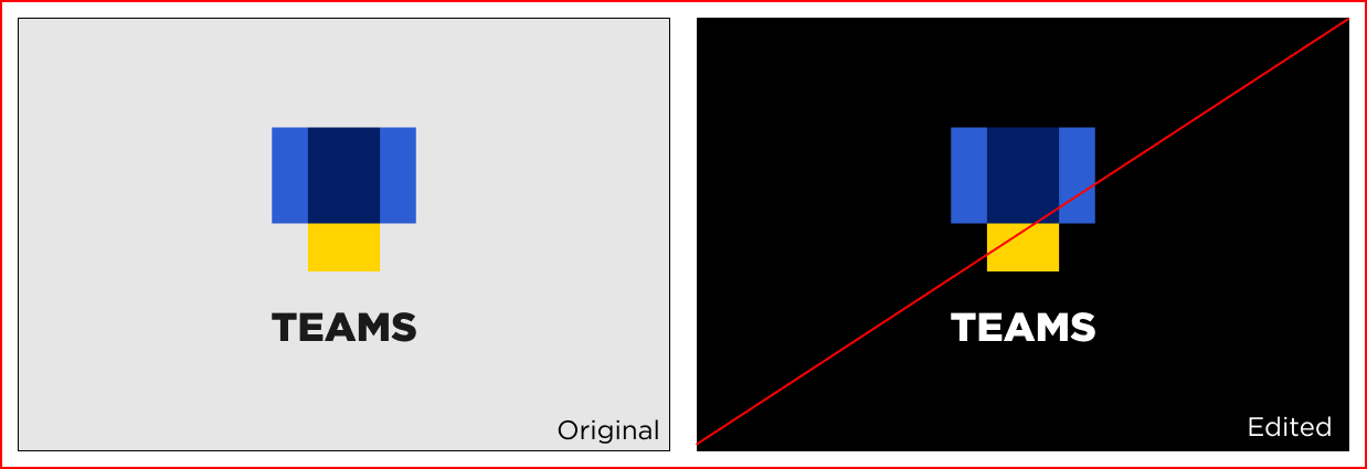
Do not change the color combination of the logo for any reason, let alone to make it fit with a background. This will also lead to inconsistencies in the brand communication
Protection zone
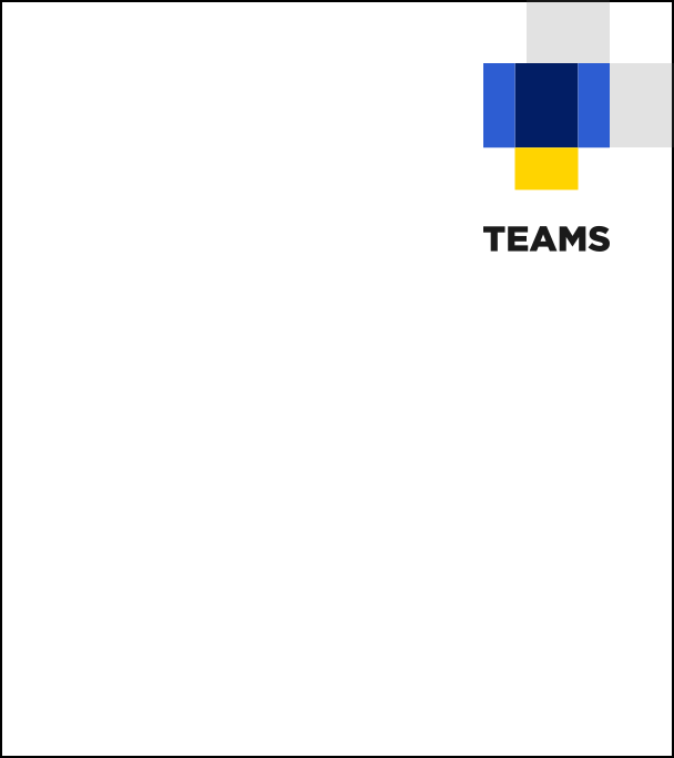
The protection zone of the logo is derived from the central square (intersection area) of the figurative mark.

Position
The logo is to be placed together with protective zone in the upper right corner of the layout.
Logo Downloads

Color Guide

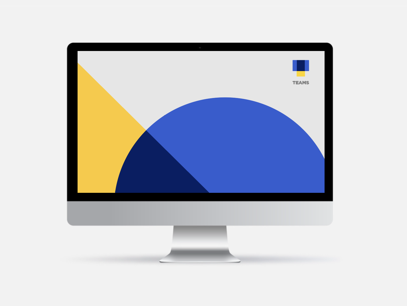
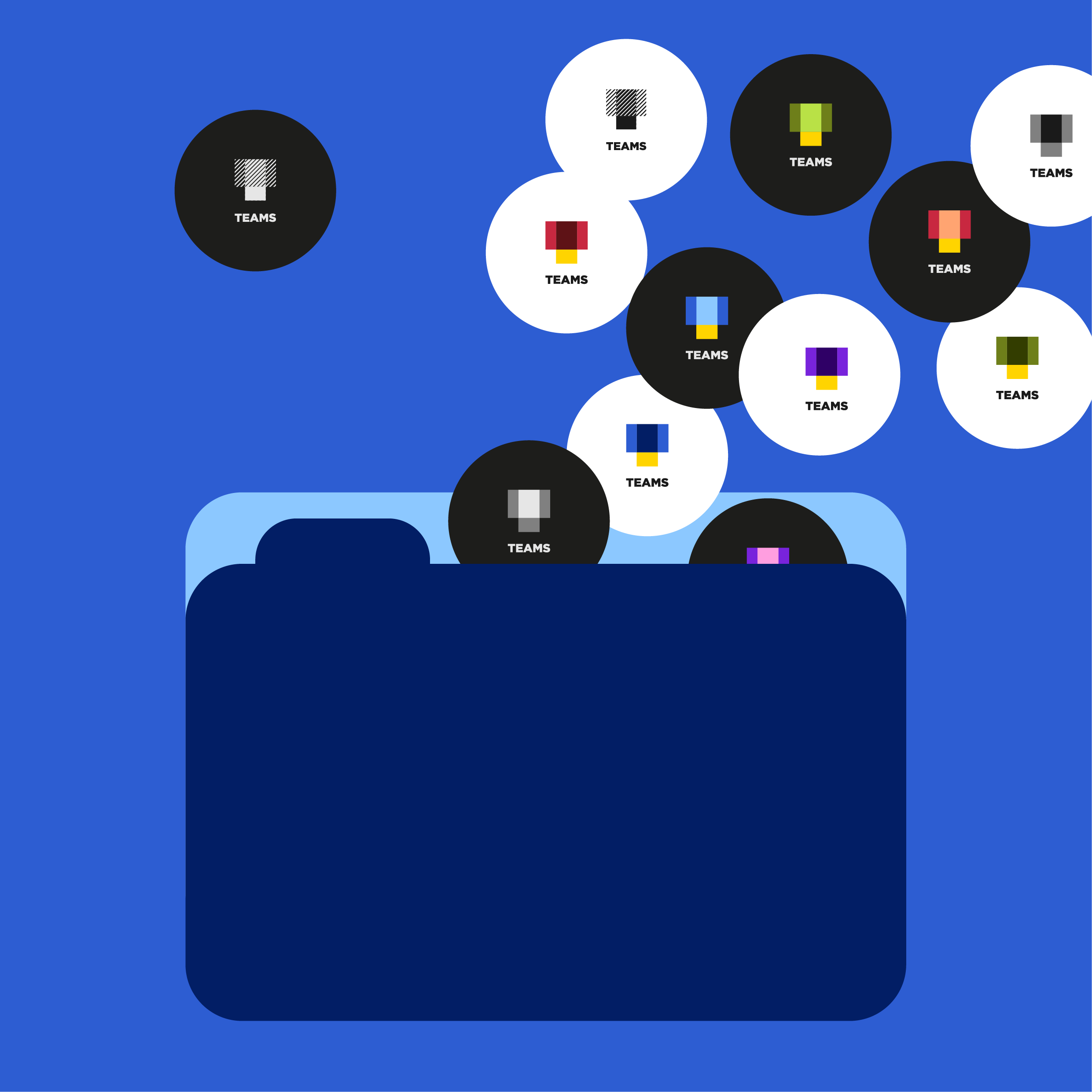
TEAMS colors are clean, fresh and modern. A touch of freshness was added by making the classic TEAMS palette brighter.
The new colors have good contrast for web and are suitable to be used in bright as well as dark screen mode.
Additionally, Kearney purple was integrated into the TEAMS palette, giving us the opportunity to highlight and reference in our communication the fact that we are part of the leading management consulting firm.
Color Downloads


Font Guide

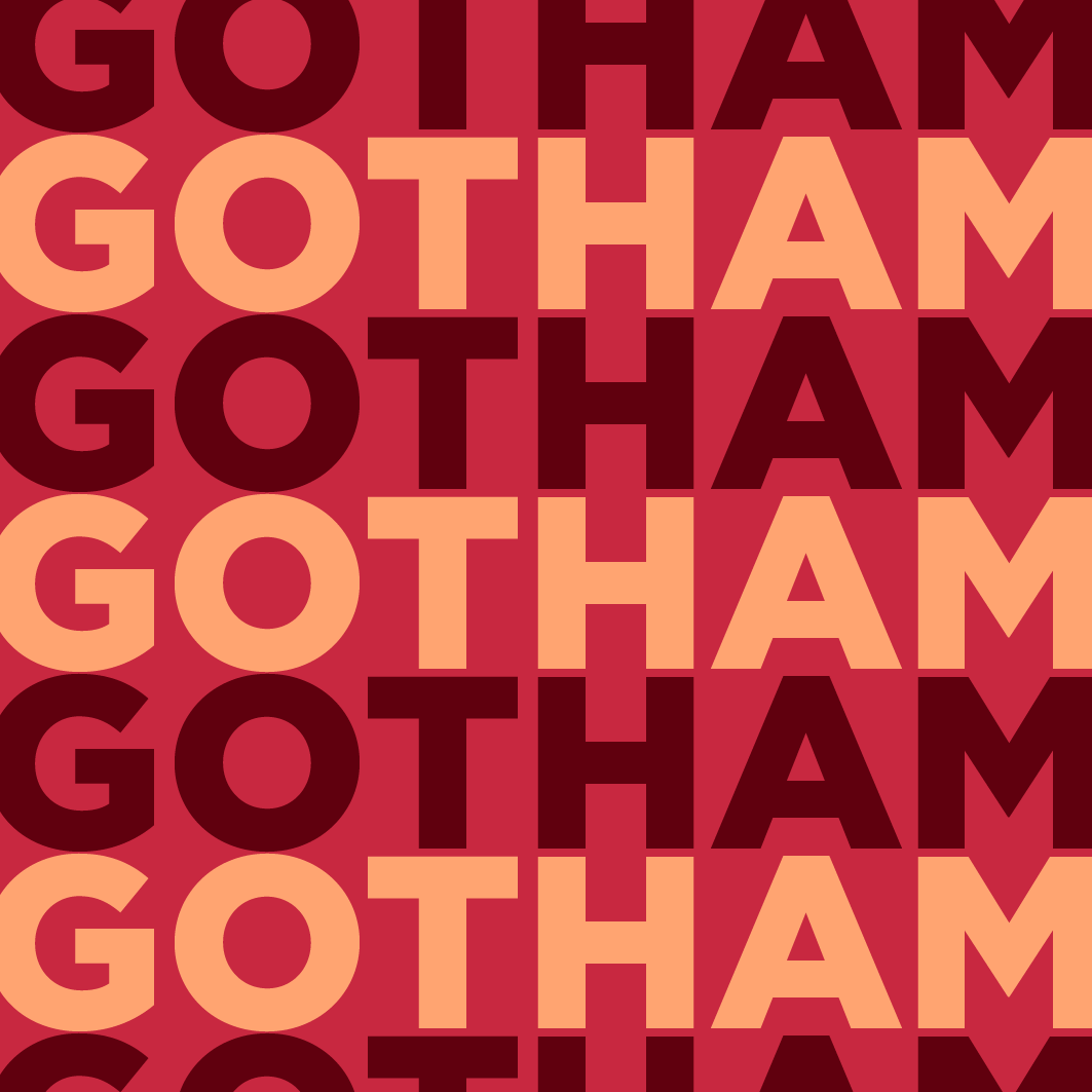
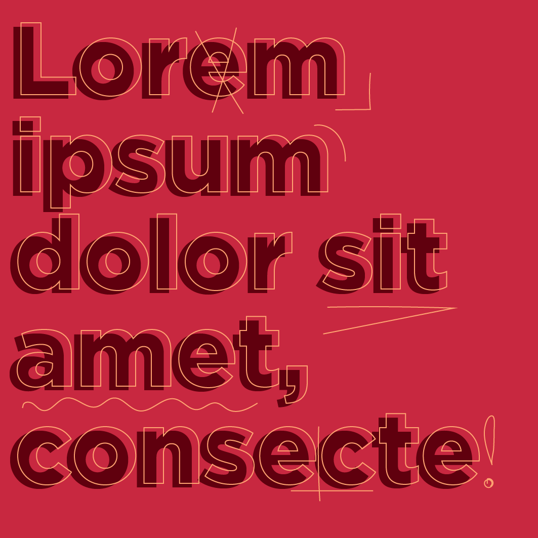
TEAMS Corporate font is Gotham
- Gotham Black is used for headlines, sub headlines are written in Gotham Light.
- Use Gotham Book for paragraphs.
- All texts are left-aligned.
- If Gotham is not available (e.g. iPad), Verdana is used.
Font Downloads
Font
TEAMS Corporate font is Gotham
- Gotham Black is used for headlines, sub headlines are written in Gotham Light.
- Use Gotham Book for paragraphs.
- All texts are left-aligned.
- If Gotham is not available (e.g. iPad), Verdana is used.
- On light mode, texts are written in TD_Medium-Grey. Use black for accentuation.
- On dark mode, texts are written in TD_Medium-Grey. Use TD_Light-Grey for accentuation.